|
VISUALIZING DATA
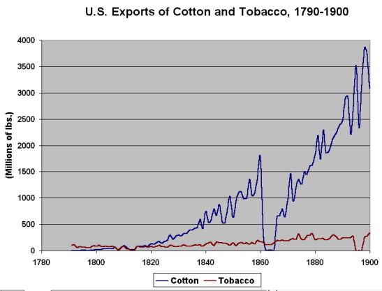
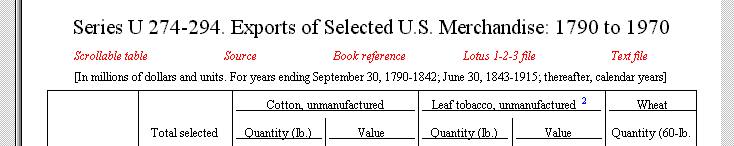
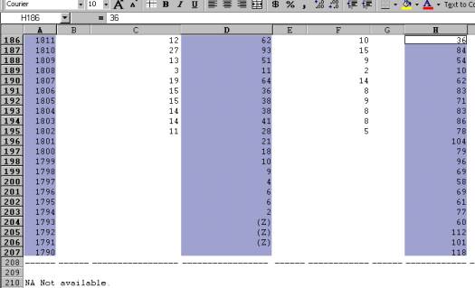
From the graph above, we see how Tobacco's early importance in the export market was swamped by cotton by around 1830. We also see the cyclic nature of cotton production, and the fact that its importance did not lessen after the Civil War. Note that cotton exports did not necessarily fall to zero during the Civil War, but data are simply not available. Certainly they dropped dramatically. Data for tobacco in the 1890s are also missing. It might be interesting to compare price data with production data. What would you expect to find? NOTE: Make sure you read the description of the data, the source of the data, and any applicable footnotes, so that you understand its reliability and validity. Back to the Historical Statistics description. HOW TO VISUALIZE DATA The chart above is based on data from the Historical Statistics CD, imported into and plotted in Excel. Here are the steps: Locate the desired data on the CD-ROM. Click on the "+" signs on the contents until you find the section you are interested in.
When you have the table in the right-hand window, several options will be presented (in red below).
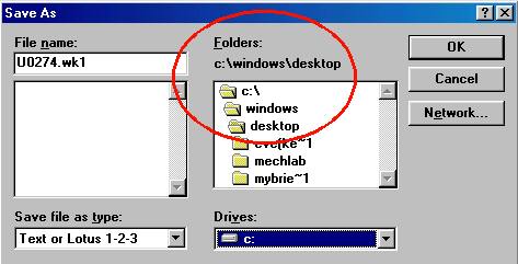
Save the table as a Lotus-123 file (this is the only spreadsheet option in the software.) I suggest saving the file temporarily to the computer's desktop (C:\WINDOWS\DESKTOP ), or to a floppy or a zip disk.
Start Excel, and open the saved file. Select the data series you want to graph, but dragging over it with the mouse. If you want to use several series (such as the year, and the two export series above), you can continue to select by holding down the Ctrl key as you select. MAKE SURE YOU SELECT THE SERIES YOU WANT TO HAVE ON THE X-AXIS FIRST -- IN THIS CASE, THE YEARS. If you want to graph columns D and H against column A (in this case, year) your selections should look something like this:
With the data selected, click the Chart
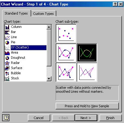
Wizard icon For the graph above, I choose x-y plot, and intersecting lines with no symbols, shown below.
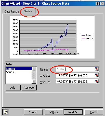
Click Next> and choose the Series tab (see below). You can enter names of the series in the Name: field (circled), corresponding to the series you have chosen. To enter a name for series 2, highlight Series2, and fill in the name. When done, click Next.
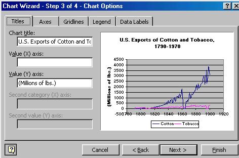
At this point, you can give the chart a title, label the axes, and set the scale and font of the axes. Experiment with what you can do at each of the tabs. When done, click Next>
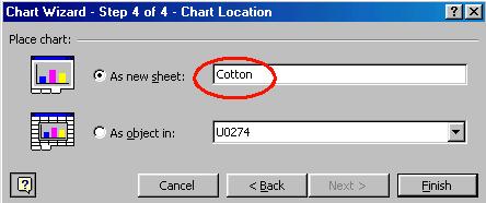
Finally, choose where to place the table. I like to put the table in its own worksheet, but you can also have it in the data worksheet, if you like. To make a separate worksheet, click "As New Sheet", and give it a sheet title. When done, click Finish.
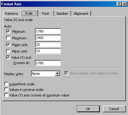
To change the scales of the X and/or Y axes, to fit the data better, right-click on one the axes, and choose Format Axis. The following dialog box appears. Experiment with the different tabs, and see what they do to the chart.
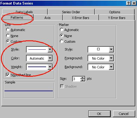
To change the color or weight of the lines in the graph, right click ON ONE OF THE DATA LINES, and choose "Format Data Series..." A dialog box appears that lets you change the color and weight of the lines. Experiment.
When you are done, you should save the
file as an Excel file type (*.xls). |
|
|